Luigi Digital Production

An accumulation of digital production work

VIDEO PRODUCTION

In-class Minute Video

I have dabbled into video editing before for fun and experimentation as I love phoneography and capturing moments. Since the clips on this video have been supplied, the video editing process focuses on adjusting clips, transitions and audio. The software, Premiere Pro, offers generated captions removing the hassle of aligning text to the audio and video .

Readability for the title clip is crucial as it needs to be short, informative and engaging, it sets the standard for what content is about to follow after. Hence, ‘Coastal Waters & Oysters’ remains capitalized and bold to emphasize the video matter and the remaining text displays additional information about what to expect. I have learned that picking a colour from an image that is already being used or is the background is important for cohesiveness, so I choose a light beige to contrast the darker blue-grey shade behind.

The scenes needed to be arranged by what Charles was discussing as the b roll is a visual representation of what the topic is. A simple fade in and out eases the eyes when transitioning from clip to clip, this adjustment allowed for a smoother flow for the video. In addition, adding photos to a video requires proper framing and alignment to ensure that it adds visually and does not take away any important assets to the video.

A short interview with Charles discussing the beauty of coastal waters and oysters.

TRU Introduction Video

I had an absolute blast shooting and editing this video assignment, I have always liked creating content but don’t have the time for it. I filmed hundreds of short clips, ensuring I have options for scenes. From the start I knew I wanted to include a few ‘outfit clips’; I try to be fashionable/stylish and ought to involve it in this video somehow. I also envisioned a cinematic look for this video, I believe by adding a greenish tint and a warmer hue, I achieved the aesthetic I was hoping for – I applied this to all my clips to keep things consistent. Additionally, the transitions tied up everything as I applied them to scenes with movement and mimicked the action through those transitions.

In regards to the audio, the intro song is by Kanye West’s ‘Touch The Sky’ – it had the upbeat, RnB vibe I was aiming for, to preview my musical taste. Before the intro transitions to my speaking audio, I also exported an instrumental track of the same song to continue the beat so that the lyrics didn’t collide with what I was saying. When recording my voiceover, I had numerous takes of the same script and spliced the best lines from different audios. The software I was using, CapCut, does not have an auto-generated captions feature, this lengthened the post-production as I had to scribe my lines and adjust the duration per each sentence.

Fun Fact- By chance, someone was laughing in the background when I was filming my opening scene, so the audio is a diegetic sound and not an outsourced laughing track.

I hope you enjoy this short video and thank you for learning more about me!

ANIMATIONS

In-class Animation

Through the tutorial we received on how to use Abode Animate, I was able to create this simplistic short animation. The software provided the background and character I had chosen; I had to adjust the ocean background to make sure it fit the frame and lasted the entire duration of the clip. For the snail, I followed the classic tween format, where we insert the figure we want into the frame and implement a new frame (pressing the F6 key) to the position we want the character to be at the end. Then click the ‘classic animation’ button for it to run.

A 2-second clip displaying a very simple classic tween animation.

20 second Animation

The following animation is a longer implementation of the classic tween. I must admit, it is beginner and basic but I believe with the limitations I had with only using the resources available on the software, that I was able to utilize the characters and effects to produce a somewhat cohesive storyline. I wanted the opening scene to demonstrate that this scenario is taking place somewhere in the world, hence the globe expanding.

I adopted a short story plot mountain, setting the scene with calmer and optimistic characters such as the girl cycling and the birds flying over. The rising action comes when smoke appears and the witch makes its first appearance, and curses the village. We soon realize the land is cursed and filled with monsters beneath and the boy gets eaten by a massive earthworm, this is where the plot reaches its climax. To add more action, I emulated a comet landing awakening the rise of zombies. As the zombie emerges, the witch realizes that what she has done is wrong and breaks the curse, resolving the problem. This may not be the most intriguing or complex storyline but it was fun to make and creatively stimulating as I have never done animation before. So enjoy!

A 20-second clip demonstrating a prolonged application of the classic tween.

PHOTOGRAPHY

Photo Editing

This semester was my first time exploring Photoshop, I often use simpler applications on my phone for editing my pictures but the capabilities of the Adobe software are incredibly efficient and vast in comparison to having multiple editing apps downloaded just to polish a single image. Features such as the selective tool expedite post-production when there is a need for masking or removing objects or just experimenting with depth – specifically through fonts and features of an object. With most Adobe software, I have realised layering is the most vital practice for a quicker and more effective creative procedure, as there are details in an image we want to single out and modify individually.

Editorial photo of a lady wearing a hat with ‘Magazine’ placed behind it.
A beach scenery with the word ‘Relax’ superimposed on the image and the branches of a coconut tree emerging from the letter E.
The ampersand filled with dead branches.

Product Shot

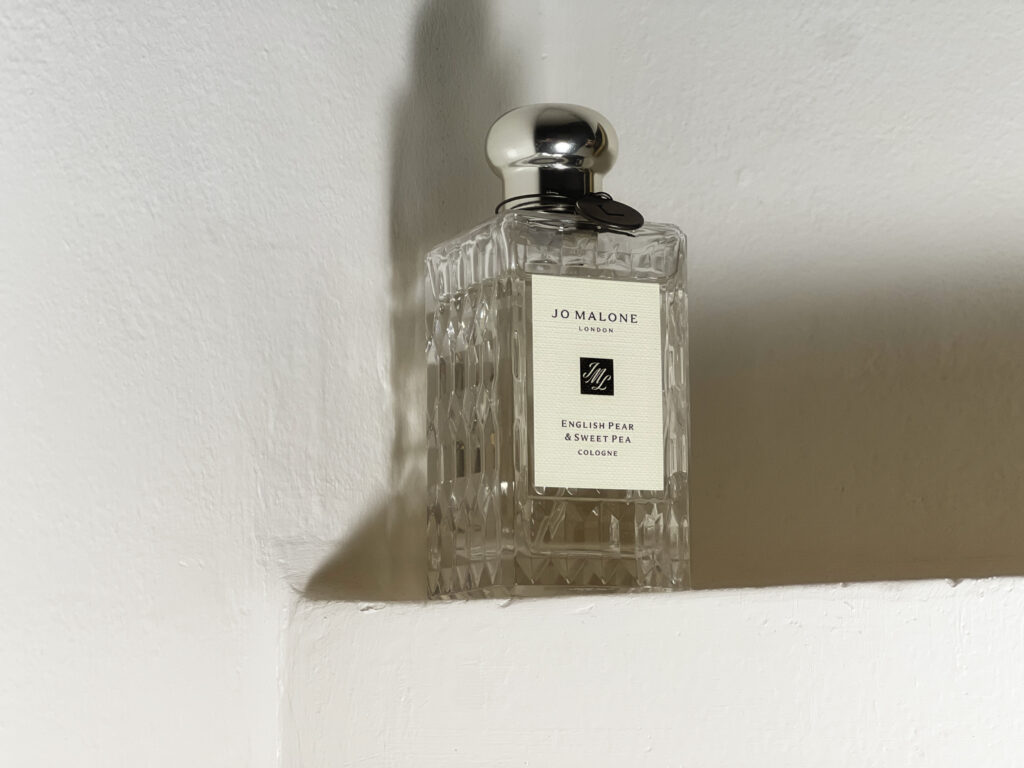
Initially, I knew the subject I wanted to highlight was a product that I used every day, as an International student I didn’t have varying items to select from. So I landed on my daily cologne as the glass bottle’s shape and texture are visually interesting but not too complex or distracting. Therefore, I placed it on a white wall shelf and played around with lighting and shadows. In editing, I applied a Nik Color Efex filter on the image to have a warmer and softer tone to it, implying the kind of inviting aura the scent would give to a person wearing it. The filter mutes down the harsh reflections of the light originally, making this product shot dreamier and more luxurious.

A displayed Jo Malone London cologne in the scent ‘English Pear & Sweet Pea’

ILLUSTRATIONS

The first software I was introduced to this semester was Adobe Illustrator, where we learned how to utilize the workspace and the accompanying devices that made the illustrating progress smoother, the Wacom. At first instance, I struggled with using the pencil and navigating how it glides and the functions that come with it. So at times when I found myself redoing the same line for the fourth time, I would use the mouse for more accurate guidance. Other than the numerous trials and errors, I enjoyed illustrating digitally as I enjoy sketching on paper in my free time.

Practice Makes Perfect

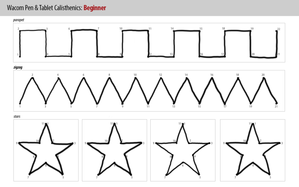
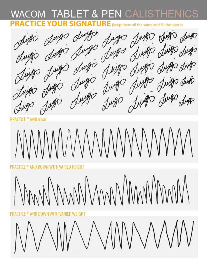
Tracings substantially helped with familiarizing the hand movements and coordination to illustrate a more prominent line, especially through varying thickness and height. Meanwhile, practising my signature was somehow therapeutic and allowed me to get used to having a looser grip on the pencil as there were times when I was straining my wrist and applying too much pressure onto the Wacom, ultimately losing shape.

Connect the dots exercises on the Wacom for beginners
Signatures and up/down pattern practices on the Wacom

The Starry Night Soothes the Sleeping Fox

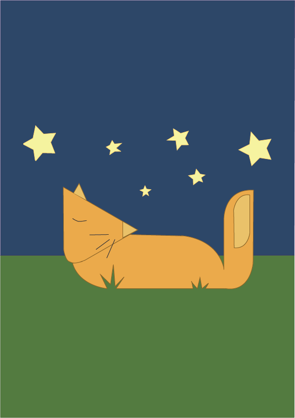
When creating my ‘Sleeping Fox’ illustration I aimed to use and organise my layers properly to have a more seamless illustrative process, I found this vital when using this software as lines, shapes and colours can easily be misplaced. With the practice I’ve done before, I found this illustration a lot easier as it majored in straight lines. However, the curved lines weren’t necessarily difficult but rather time-consuming. I found this tracing illustration a lot easier than I expected as it didn’t require any intricate details and therefore made drawing straightforward. Since I didn’t have any creative input towards the outline of the piece I decided to display my aesthetic through the colour palette.

The starry night soothes the sleeping fox

Quadrant Tracing

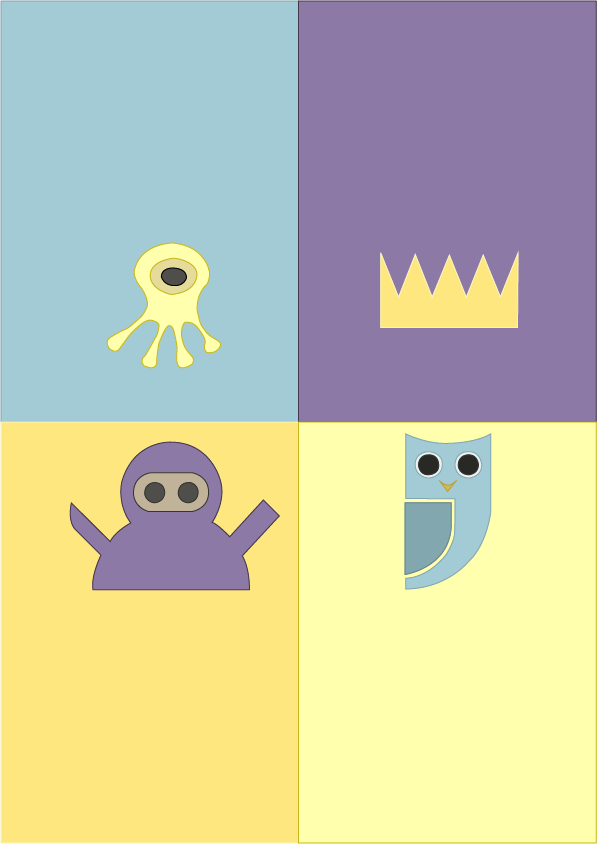
Redrawing these simple outlined figures was uncomplicated yet repetitive, I maintained the same process- having separate layers for each character and organizing the order of lines and shapes accordingly. I did one figure at a time and in comparison to the previous exercise, this consisted of more curvature – so those lines took several attempts to have a precise trace. I played around with pastel colours and stuck to a purple, blue and yellow scheme. This final tracing piece properly prepared me for the final assignment.

A crown, a yellow alien, a blue owl and a purple ninja

Luigi’s bicycle

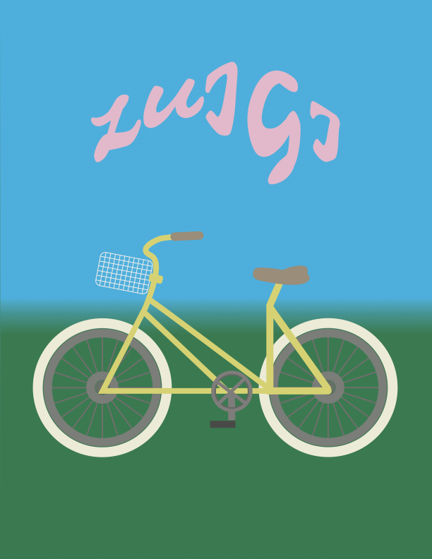
This bike illustration truly tested my skills and patience as the process was immensely tedious compared to the previous practices. Individually the bike’s features were doable but there were just many of them. The instructions given were straightforward however there were times when I just did not know how to access a certain tool or how to use them properly, especially for the basket and spokes. Before discovering tools that illustrated an accurate and angled depiction of those features, I was using the line tool aimlessly and followed along the tracing for all parts of the bike. The ‘Grid’ tool made the basket look cleaner in comparison to my first version.

Originally the bike had an orange body and dark accessories but to show my personality, I associate cycling with the spring/summer time and stuck with colours that remind me of that season; pink and yellow pastels. To juxtapose the cookie-cutter cycle, I wanted my name to be funkier but still clean, so I picked a font with minute extensions and exaggerated the letter G for experimentation and believe the result turned out as cute as I wanted it to be!

A yellow bike, featuring a basket, white tyres, and my name ‘Luigi’ in the sky above.