The first software I was introduced to this semester was Adobe Illustrator, where we learned how to utilize the workspace and the accompanying devices that made the illustrating progress smoother, the Wacom. At first instance, I struggled with using the pencil and navigating how it glides and the functions that come with it. So at times when I found myself redoing the same line for the fourth time, I would use the mouse for more accurate guidance. Other than the numerous trials and errors, I enjoyed illustrating digitally as I enjoy sketching on paper in my free time.
Practice Makes Perfect
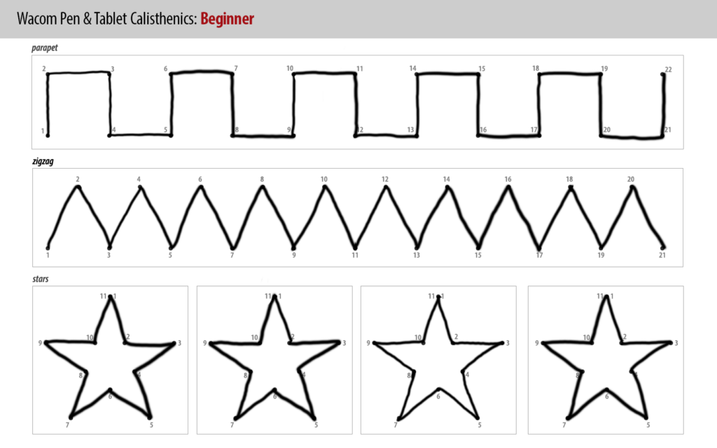
Tracings substantially helped with familiarizing the hand movements and coordination to illustrate a more prominent line, especially through varying thickness and height. Meanwhile, practising my signature was somehow therapeutic and allowed me to get used to having a looser grip on the pencil as there were times when I was straining my wrist and applying too much pressure onto the Wacom, ultimately losing shape.
The Starry Night Soothes the Sleeping Fox
When creating my ‘Sleeping Fox’ illustration I aimed to use and organise my layers properly to have a more seamless illustrative process, I found this vital when using this software as lines, shapes and colours can easily be misplaced. With the practice I’ve done before, I found this illustration a lot easier as it majored in straight lines. However, the curved lines weren’t necessarily difficult but rather time-consuming. I found this tracing illustration a lot easier than I expected as it didn’t require any intricate details and therefore made drawing straightforward. Since I didn’t have any creative input towards the outline of the piece I decided to display my aesthetic through the colour palette.

Quadrant Tracing
Redrawing these simple outlined figures was uncomplicated yet repetitive, I maintained the same process- having separate layers for each character and organizing the order of lines and shapes accordingly. I did one figure at a time and in comparison to the previous exercise, this consisted of more curvature – so those lines took several attempts to have a precise trace. I played around with pastel colours and stuck to a purple, blue and yellow scheme. This final tracing piece properly prepared me for the final assignment.

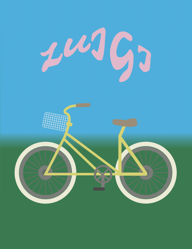
Luigi’s bicycle
This bike illustration truly tested my skills and patience as the process was immensely tedious compared to the previous practices. Individually the bike’s features were doable but there were just many of them. The instructions given were straightforward however there were times when I just did not know how to access a certain tool or how to use them properly, especially for the basket and spokes. Before discovering tools that illustrated an accurate and angled depiction of those features, I was using the line tool aimlessly and followed along the tracing for all parts of the bike. The ‘Grid’ tool made the basket look cleaner in comparison to my first version.
Originally the bike had an orange body and dark accessories but to show my personality, I associate cycling with the spring/summer time and stuck with colours that remind me of that season; pink and yellow pastels. To juxtapose the cookie-cutter cycle, I wanted my name to be funkier but still clean, so I picked a font with minute extensions and exaggerated the letter G for experimentation and believe the result turned out as cute as I wanted it to be!